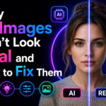
My sister showed me an AI portrait she’d made for her portfolio and asked if it looked real. It looked like someone had photographed a very beautiful mannequin. I knew immediately what was wrong — but explaining it took a while. Here’s everything I told her.
There’s a specific feeling you get looking at an AI-generated image that somehow looks beautiful but also slightly wrong. You can’t always pinpoint what it is, but something about it doesn’t sit right. The lighting is strange. The skin is too smooth. The background feels like a screen rather than a place. The eyes look at you but seem slightly empty.
This isn’t random. The uncanny valley in AI images follows consistent, identifiable patterns — and they all have fixes. Some fixes are in the prompt, some are in the tool settings, and some require post-processing. Once you learn to see what’s causing the “not quite real” quality, you can address each one directly.
I’ve been working through these systematically for about two years across Midjourney, DALL-E 3, and Adobe Firefly. Here’s what I found.
The Six Reasons AI Images Don’t Look Real
In real photographs, light comes from somewhere specific — a window, a lamp, the sun, a street sign. That source creates shadows, highlights, and a visible direction of light that tells your brain “this is a physical space.” AI images often generate even, directionless light that illuminates everything equally. Beautiful, technically, but impossible in the real world.
Your brain picks up on this instantly. Even if you can’t consciously identify “the light has no source,” you perceive the result as wrong.
Real skin has pores, subtle texture, slight unevenness, the faint trace of veins under thin skin, small asymmetries. AI skin tends toward statistical perfection — the average of millions of beauty-retouched photographs. The result looks less like a real person and more like a high-resolution photograph of a cosmetics advertisement. Perfect in a way no real person is.
Real photography has depth — there are objects at different distances from the camera, each with its own focus, lighting, and relationship to the subject. AI backgrounds, even when blurred, tend to feel “painted on” — a single plane of color and texture without genuine spatial complexity.
Real photographs have imperfections: slight camera grain, lens aberrations, focus that’s slightly off in the corner of the frame, stray hairs catching light differently. AI images are generated at ideal theoretical quality with none of these physical artifacts. The absence of imperfection is itself a tell.
AI generators tend to produce compositions that are balanced in the way graphic design tools balance things — centered, symmetrical, everything given equal visual weight. Real photographs are messier. The subject is slightly off-center, something is partially cut off at the edge, the horizon isn’t perfectly level. These “mistakes” are what make photographs feel real.
Real photographs capture a moment. There’s some indication that this happened at a specific time in a specific place — the angle of light suggests morning or afternoon, the background has recognizable context, there’s a sense that the subject just arrived or is about to leave. AI images exist in a kind of permanent now with no temporal context. They don’t feel like they captured anything because they didn’t.
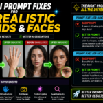
The Fixes — Each Problem Addressed
The most impactful single change in any portrait or scene prompt is adding a specific, positioned light source. Not “good lighting” or “well-lit” — a specific physical source with a direction.
“single overhead lamp, warm amber, deep shadows below”
“golden hour backlight, subject in slight silhouette, rim light on hair”
“overcast diffused light, soft shadows, no harsh highlights”
“neon sign to camera right, cool blue from left, warm red from right”
The AI defaults to its training data’s center of gravity, which for portraits is heavily weighted toward beauty photography with extensive retouching. Fighting this requires explicitly describing the opposite of perfection.
“slight facial asymmetry, natural imperfections”
“not airbrushed, realistic skin tone”
“fine lines around eyes, natural expression marks”
“real person look, documentary portrait style”
Add to your negative prompt (Midjourney –no): smooth skin, airbrushed, perfect skin, flawless complexion
AI image generators were trained on millions of photographs. When you reference specific photography equipment, styles, and techniques, the model pulls toward the visual characteristics of those references. “Shot on Canon 5D Mark IV with 85mm f/1.4” is more specific guidance than “photorealistic portrait.”
“Leica M rangefinder, 50mm, film grain, slightly imperfect focus” — documentary/street feel
“Fujifilm X100V, Acros film simulation, warm tones” — lifestyle photography aesthetic
“35mm film, slight grain, slightly overexposed highlights” — analog warmth
“medium format Hasselblad, studio photography, controlled light” — commercial/editorial
“A real photograph captures something that happened. An AI image generates something that looks like it might have. That difference is what you’re trying to close.”
Instead of describing a background as a visual object (“blurred bokeh background”), describe it as a place at a time. This produces environments with actual depth and context rather than a painted screen behind the subject.
The specific detail — rain-slicked, steam from a grate, people walking past — creates environmental texture that reads as real rather than rendered.
Even with perfect prompt engineering, AI images are too clean. Adding film grain, slight chromatic aberration, and subtle vignetting in post-production adds the physical imperfections that real cameras produce — and that our brains use as signals for “this is a photograph.”
- ›Lightroom / Camera Raw: Effects panel → Grain (Amount 15–25, Size 30–40, Roughness 50). This alone makes images read as analog
- ›Photoshop: Filter → Noise → Add Noise (2–4%, Gaussian, Monochromatic) for subtle grain without color artifacts
- ›Vignette: Slight darkening at edges (−10 to −20 in Lightroom Lens Corrections) focuses the eye and adds camera character
- ›Chromatic aberration: Very subtle color fringing at the edges of highlights (Lens Corrections → Enable Lens Profile Corrections in Lightroom adds this automatically)
AI images tend toward saturated, balanced, “ideal” color. Real photographs — especially from film stocks — have lifted shadows (not pure black), slightly muted highlights (not pure white), and color in the shadows rather than neutral grey. This is called a “cinematic LUT” or film tone. Applying this transformation in post makes images read as photographic rather than digital.
- ›Raise the blacks slightly: In Lightroom curves, lift the bottom-left point up slightly so shadows aren’t pure black
- ›Reduce clarity slightly: −5 to −10 in Lightroom takes the “HDR” quality off AI images and softens them toward film
- ›Apply a free film LUT: RNI Films, VSCO, or free Fujifilm LUTs in Photoshop. Even subtle application (20–30% opacity) transforms the color character
- ›Reduce saturation slightly: −10 to −15 globally. Real photos — especially film — aren’t as saturated as AI generates. Muted tones read as more photographic
In Midjourney, the –stylize parameter controls how strongly the AI applies its aesthetic preferences. High stylize values (500–1000) produce artistically “perfect” images that are clearly AI. Low stylize values (50–150) pull the AI closer to what you actually described, with less artistic interpretation — and that reduced interpretation usually means more photographic realism.
- ›Add –stylize 75 or –stylize 100 for most realistic outputs
- ›Add –style raw to further reduce Midjourney’s aesthetic processing
- ›In DALL-E 3: use the word “photorealistic” and reference a specific camera — it follows literal instructions more closely than Midjourney
The Full Realism Checklist — Use This for Every Image
The Tools That Help Most
Mistakes That Make AI Images Look More Artificial
These words are in almost every AI image prompt ever written. The model has seen “photorealistic portrait” paired with millions of AI-generated images, many of which are not photorealistic at all. The word has lost specificity. It tells the model almost nothing useful. Replace it with specific photography vocabulary: camera model, lens, lighting setup, film stock. Those terms are still meaningfully connected to actual photographic characteristics in the training data.
There’s a point where adding grain, imperfection language, and film tones tips over from “realistic” to “obviously processed to look old.” Grain at Amount 15 looks like film. Grain at Amount 50 looks like a filter. Saturation at −10 looks natural. Saturation at −40 looks like an Instagram filter from 2012. The goal is subtlety — barely perceptible changes that add up to a different overall impression, not visible filters.
The instinct when an AI image almost works is to generate more variations until you get one with no flaws. But often the version with one imperfect hand or a slightly odd background element is more convincing than the “perfect” version — because the imperfection is the tell of realness. Learn to accept and even lean into the small things that don’t quite work. Perfection is what you’re trying to move away from.
Making AI images look more realistic has legitimate uses — concept art, creative projects, portfolio mock-ups, visual development. Using realistic AI images to misrepresent products, people, or events crosses into deceptive territory that can have real consequences. The skill of making AI images look real is a creative tool, not a deception tool. Worth being clear about that distinction in how you use and label AI-generated work.
What Changed With My Sister’s Portfolio Image
The original prompt was something like “professional woman, business portrait, confident, high quality.” Beautiful technically. Obviously AI to anyone who looks closely.
We rewrote it: “Environmental portrait, professional woman at a desk in a modern office, late afternoon window light from camera left, warm shadows on right side of face, natural skin texture, slight asymmetry, Nikon D6 85mm look, documentary portrait style, not airbrushed.” Added –stylize 100 –style raw.
The second generation wasn’t perfect — one hand was slightly off, background was still a bit clean. But the face read as a real person because the light had a direction, the skin had texture, and the expression wasn’t posed in the way AI defaults to. We added film grain in Lightroom, lifted the blacks slightly, and reduced saturation by −8.
The result: three people who saw the portfolio assumed it was a real photograph. One asked who took it.
Name your light source and its direction — this is the most impactful single prompt change. Add skin imperfection language for portraits. Reference a specific camera and lens. Lower your stylize value. After generating, add film grain in Lightroom at Amount 15–25, lift your blacks slightly, reduce saturation −10. These six changes applied together bridge most of the gap between “obviously AI” and “wait, is this real?” The goal isn’t to deceive — it’s to make images that serve their creative purpose without the distraction of the uncanny valley getting in the way.